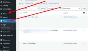
To make a website responsive in Elementor, switch to ‘Responsive Mode’ and adjust settings for mobile, tablet, and desktop. Customize each element’s responsive properties individually for optimal display across devices.
Creating a responsive website ensures it adapts and looks great on any device, be it a desktop, tablet, or mobile. As web traffic increasingly shifts towards mobile devices, it becomes critical to tailor the user experience to suit all screens. Elementor, a powerful WordPress page builder, offers a streamlined solution to achieve a responsive design easily. by following the instructions of this blog post, you can get an elementor responsive website.
Designers can take advantage of Elementor’s intuitive interface to customize layouts and ensure their site maintains functionality and aesthetic appeal at every screen size. By focusing on responsive design, website owners can maximize reach and engagement, contributing positively to SEO efforts and user satisfaction.
The Rise Of Mobile Browsing
The way we access the internet has changed dramatically over the years. A significant shift toward mobile browsing means that websites must adapt to smaller screens. This is not just a trend but an evolution in users’ browsing habits. To stay relevant and accessible, a responsive design is no longer optional; it’s vital.
Statistics That Prove The Need For Responsive Design
Numbers speak louder than words—and the numbers are clear. Here’s a snapshot:
| Metrics | Statistics |
|---|---|
| Mobile Internet Users | Over 54% of global website traffic |
| User Preference | 85% of adults think a website should look as good on mobile as on a desktop |
| Mobile E-commerce Sales | Mobile sales account for 50% of all online transactions |
| Bounce Rate | Users are 5 times more likely to leave if the site isn’t mobile-friendly |
These figures highlight the critical need for responsive web design.
Impact On User Experience And Seo
A website that scales seamlessly across devices enchants visitors and keeps them engaged. A positive user experience translates to lower bounce rates and higher conversion rates. But the impact doesn’t end there:
- Google prefers mobile-friendly websites, and this affects your search engine ranking.
- A responsive site means one URL and one content source, which is easier for Google bots to crawl.
- Page load time is a ranking factor; responsive websites load faster on mobile devices.
- Responsive websites provide a boost to social sharing since content looks good across all platforms.
Together, these aspects enhance SEO efforts massively, making a responsive design non-negotiable.
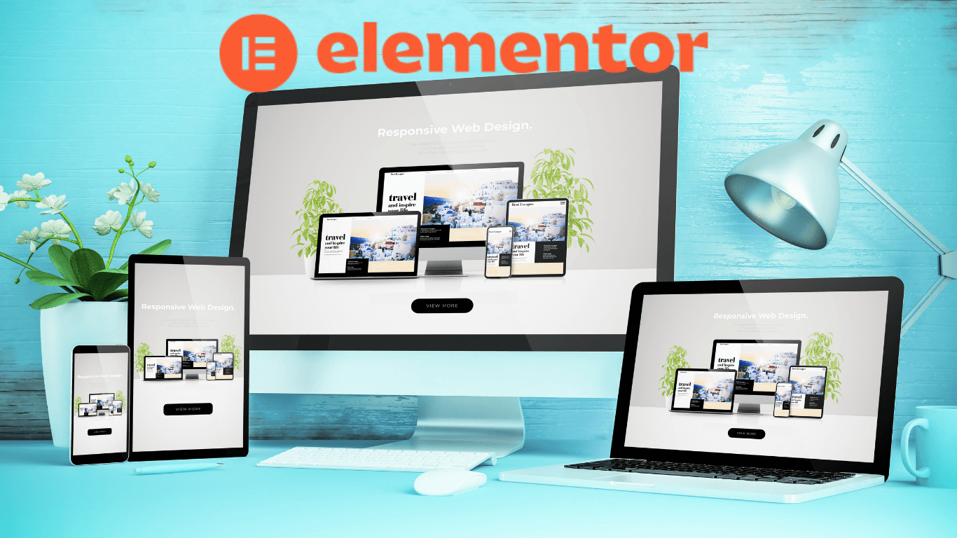
Elementor: A Powerful Page Builder

Elementor transforms the way you build websites. This page builder makes creating stunning, responsive sites easy. You don’t need to write a single line of code. With its drag-and-drop interface, Elementor is a favorite choice among professionals and beginners.
Features That Facilitate Responsive Design
Responsive design is a must-have for a successful website. Elementor offers features that ensure your site looks good on all devices.
- Mobile Editing: Customize how your site appears on different devices with ease.
- Column and Content Positioning: Adjust margins and padding for perfect alignment.
- Reverse Columns: Flip the order of columns when you shift from desktop to mobile.
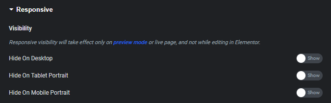
- Visibility Control: Show or hide widgets and sections on specific devices.
Comparing Elementor To Other Page Builders
Elementor stands out with its user-friendly interface and powerful features. Let’s see how it stacks up.
| Page Builder | Drag-and-Drop | Pre-built Templates | Responsive Controls |
|---|---|---|---|
| Elementor | Yes | Yes | Comprehensive |
| WPBakery | Yes | Yes | Basic |
| Thrive Builder | Yes | Yes | Limited |
Building A Responsive Website With Elementor
Elementor makes your website look great on any device.
It’s a powerful tool for WordPress users.
Choosing A Responsive Theme
Picking the right theme is crucial for a responsive website.
- Select themes labeled as ‘responsive’.
- Check that it works on various devices.
- Look for reviews and ratings for quality.
Elementor works best with responsive themes.
Starting With Elementor Templates
Begin with built-in responsive Elementor templates.
- Choose a template from the library.
- Import the template into your site.
- Customize it with the drag-and-drop editor.
Templates save time and make sure your site looks great on all screens.
Remember, a responsive design is key to user experience!
Customizing Responsive Settings In Elementor
Customizing Responsive Settings in Elementor is like using a magic wand on your website. Websites should look great on any device. Elementor makes that easy. Let’s learn how to use Elementor’s tools to fine-tune your site’s responsiveness.
Using Mobile Editing Tools
Your audience is mobile, and so should your website be. Elementor’s mobile editing tools let you tailor your site for smaller screens. You can tweak text sizes, columns, and more with just a few clicks. These tools are in the Elementor editor. Look for the desktop, tablet, and mobile icons at the bottom of the panel.
- Change font size and spacing for readability.
- Adjust column stacking to keep layouts clean.
- Modify padding and margins for the perfect fit.
Setting Elementor’s Responsive Controls
The right controls can take your site from good to great on mobile devices. Elementor’s Responsive Controls are simple yet powerful. Here’s how to use them:
| Action | Effect |
|---|---|
| Toggle Visibility | Show or hide elements on different devices. |
| Responsive Font Sizes | Text looks perfect on any screen. |
| Reverse Columns | Switch order for better mobile storytelling. |
Look for the Responsive tab in the Elementor editor. You will find the settings you need under each widget’s Style and Advanced tabs. Play with these settings to see immediate changes on your site’s preview.
Troubleshooting Common Responsive Issues
Welcome to ‘Troubleshooting Common Responsive Issues’ when using Elementor to design your website. A responsive site looks great on any device. Yet, some problems can pop up. Let’s fix them together!
Maintaining Layout Integrity Across Devices
Keeping your layout consistent on different devices is key. Here are tips:
- Test your layout on various screens.
- Use Elementor’s responsive design controls.
- Adjust margins and padding for each device type.
- Stack columns on mobile for a clean look.
Remember to check your work. See your site on a phone, tablet, and desktop.
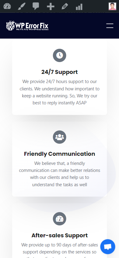
Ensuring Media Elements Adapt Properly
Images and videos must look good everywhere. Make sure the media adjusts to all screen sizes.
| Action | Result |
|---|---|
Set images to width: 100%; | Images grow or shrink with the screen. |
| Choose responsive video widget. | Videos fit the screen perfectly. |
Always preview your site on different devices to catch media issues early.
Enhancing Responsiveness With Elementor Pro
Elementor Pro turns the dream of a perfectly responsive website into reality. It goes beyond basic adjustments to ensure your site looks spectacular on all devices. Let’s dive into the tools that make it happen.
Advanced Widgets And Features
Elementor Pro unlocks a suite of advanced widgets and features tailored for responsiveness.
- Sliders & Carousels: Adjust image sizes and text for every device.
- Toggle Elements: Show or hide widgets based on the user’s screen.
- Responsive Font Sizes: Text scales to fit various screens seamlessly.
Creating Custom Breakpoints For Unique Devices
Every device is different. Custom breakpoints in Elementor Pro give control over how your site adapts.
| Device Type | Custom Breakpoint |
|---|---|
| Phones | 360px |
| Tablets | 768px |
| Laptops | 1024px |
Use Elementor's visual editor to set these breakpoints. Watch your design adapt in real time.
Testing And Refining Your Responsive Site
Creating a responsive site with Elementor is just the beginning. The real game starts when you test and refine the website’s performance across different devices. This phase is crucial as it determines how well your site adapts to various screen sizes and user interactions. Let’s ensure that the website offers a seamless user experience.
Using Emulators And Real Devices
Testing on emulators and real devices gives you a clear picture of your site’s responsiveness. Emulators simulate various devices on your computer, helping you quickly identify issues.
- Check layouts on different screen sizes.
- Test touch interactions and mobile gestures.
- Verify loading times and media adaptability.
Real devices, on the other hand, provide actual user interaction insights.
- Test on multiple smartphones and tablets.
- Use various browsers to check compatibility.
- Assess the website performance in real-world use cases.
Gathering User Feedback For Iterative Improvements
User feedback is invaluable for iterative improvements. It helps understand how users interact with your site and what changes can enhance their experience.
| Feedback Type | Tools to Use | Improvements |
|---|---|---|
| Surveys | Online Polls, Feedback Forms | Better Content, User Pathways |
| User Testing | Session Recordings, Heatmaps | Enhanced Navigation, Speed |
Reach out to your audience through social media and email campaigns. Engage with them to collect valuable insights on their experience. Continuously update and refine your site to ensure it stays ahead in the responsive game.
Frequently Asked Questions For Make The Website Responsive Using Elementor
How Do I Make My Elementor Website Responsive?
To make your Elementor website responsive, use adjustable column widths and mobile fonts. Employ the mobile editing tools for visibility control. Optimize padding and margin for various devices. Test with Elementor’s responsive mode for precision across screen sizes.
How Do I Make My WordPress Website Responsive?
Choose a responsive theme in your WordPress dashboard. Utilize plugins like WPtouch for mobile-friendly content. Employ responsive design elements, such as flexible images and media queries. Test your site’s responsiveness using tools like Google’s Mobile-Friendly Test. Ensure all content scales properly on different devices.
How Do I Make A Responsive Menu In Elementor?
To create a responsive menu in Elementor, drag the ‘Nav Menu’ widget to your page, select a menu, and customize its design under ‘Style’. Ensure ‘Mobile Dropdown’ is enabled for small screens in ‘Content’ settings.
How Do I Change The Responsive Size In Elementor?
To change the responsive size in Elementor, go to the Elementor panel, click on the responsive mode icon, and select the device type. Adjust the settings as desired for each device view.
Conclusion
Wrapping up, and embracing Elementor for a responsive website design is invaluable. It streamlines the process, offering flexibility and control. Remember, user experience is pivotal in the digital realm. Utilizing Elementor effectively ensures your site’s adaptability across devices, essential for maintaining traffic and ranking.
Start revamping your pages today—your audience will thank you.