Elementor is a powerful page builder for WordPress. Maintaining the correct aspect ratio ensures your design looks consistent across all devices. A 16:9 aspect ratio is common for videos and images, providing a balanced and professional appearance. By using custom CSS, you can achieve this easily and ensure responsiveness.
Here’s how to do it:
Method 1: Using Custom CSS
Start by selecting the container you want to style. Assign a custom CSS class. For example, use aspect-ratio-16-9. This makes applying styles easier. You’ll find this option under Elementor’s Advanced tab.
Once you’ve added the class, include the CSS code. Paste it into your theme’s stylesheet or Elementor Pro’s Custom CSS field. The code looks like this:
.aspect-ratio-16-9 {
  position: relative;
  width: 100%;
  padding-top: 56.25%; /* Maintains 16:9 ratio */
}

.aspect-ratio-16-9 > * {
  position: absolute;
  top: 0;
  left: 0;
  width: 100%;
  height: 100%;
}
This code creates a responsive container. The padding-top value ensures the height adjusts to the width. This technique works for videos, images, and any other content.
Check the results in preview mode. Your container should now maintain the correct ratio. Adjust the CSS class as needed for other elements. Keep the process consistent for a uniform layout.
For those without Elementor Pro, use WordPress Customizer. Go to Appearance > Customize > Additional CSS. Add the same code there. This approach works globally for your website.
Customizing Content Inside the Container
The container only sets the outer shape. You must also style its content. Images and videos need specific rules. Without these, they may not scale properly.
For images, use this CSS code:
.aspect-ratio-16-9 img {
  width: 100%;
  height: 100%;
  object-fit: cover;
}
The object-fit property ensures images look natural. Use cover to fill the space or contain to fit inside. Experiment to find what works best.
For videos, apply similar styling. Use the following code:
.aspect-ratio-16-9 iframe {
  width: 100%;
  height: 100%;
}
These settings ensure videos adapt to the container. They also prevent black bars from appearing. This is crucial for a polished look.
Test your site on multiple devices. This step confirms everything displays as intended. Small changes in CSS can make a huge difference.
Method 2: Using Additional CSS in Theme Customizer
If you don’t have Elementor Pro or prefer adding custom CSS globally, you can do it in your WordPress theme’s Customizer or Additional CSS section:
- Go to Appearance > Customize.
- Select Additional CSS and add the following code, targeting the specific container by its CSS class or ID.
.your-container-class {
    position: relative;
    width: 100%;
    padding-bottom: 56.25%; /* 16:9 aspect ratio */
}

.your-container-class > * {
    position: absolute;
    top: 0;
    left: 0;
    width: 100%;
    height: 100%;
}
Replace .your-container-class with the specific class or ID of the container.
Method 3: Using Elementor’s Minimum Height
Alternatively, you can achieve a 16:9 aspect ratio using Elementor’s minimum height setting:
- Select the container in the Elementor editor.
- Go to the Layout tab.
- Set the Width to 100% under Content Width.
- Under Height, choose Min Height and set the height to 56.25% of the width.
This approach ensures the container maintains a 16:9 ratio, though it’s less precise than using the CSS methods above for dynamically scaling content.
This technique helps in delivering a visually appealing layout, enhancing user experience. Learning these skills can significantly improve your website’s design and functionality. Keep reading to discover step-by-step instructions on how to implement this in your Elementor projects.
Credit: elementor.com
Introduction To Aspect Ratios
Aspect ratios are crucial for web design. They define the proportional relationship between width and height. Maintaining aspect ratios ensures your content looks great across devices.
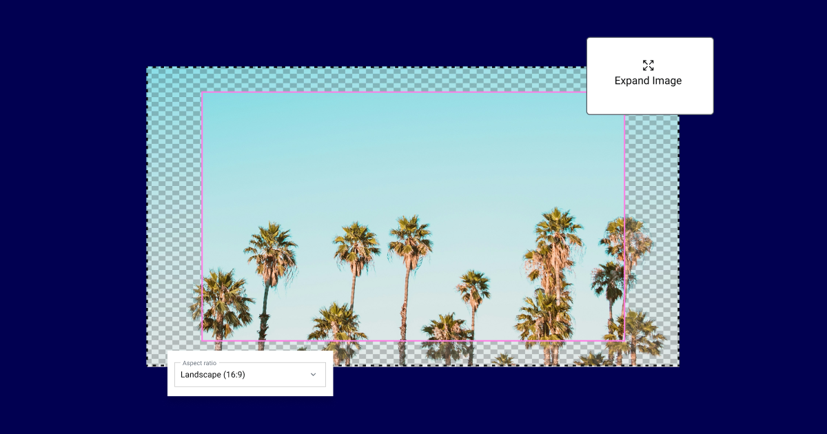
What Is 16:9?
The 16:9 aspect ratio is a standard for video and images. It means for every 16 units of width, there are 9 units of height. This ratio is common in HD video and widescreen displays.
| Width | Height |
|---|---|
| 16 units | 9 units |
| 1920 pixels | 1080 pixels |
Importance Of Aspect Ratios
Aspect ratios ensure consistent design. They help in making your content visually appealing.
- Consistency: Keeps design elements uniform.
- Versatility: Adapts well to different screens.
- Professionalism: Gives a polished look to your site.
Maintaining the correct aspect ratio is important. It avoids distortion and keeps your design balanced.
How To Maintain 16:9 Aspect Ratio For Elementor Container
Using Elementor, you can easily maintain the 16:9 ratio. Follow these steps:
- Add a new container.
- Set the width to 100%.
- Use padding to maintain the 16:9 ratio.
Here’s a sample CSS code for maintaining the 16:9 ratio:
      .elementor-container {
        position: relative;
        width: 100%;
        padding-bottom: 56.25%; / 16:9 ratio /
      }
      .elementor-container >  {
        position: absolute;
        width: 100%;
        height: 100%;
        top: 0;
        left: 0;
      }
Why Use 16:9 In Elementor
Using the 16:9 aspect ratio in Elementor ensures your design looks professional. This aspect ratio is widely used in various media formats. It provides a balanced and visually appealing layout.
Visual Appeal
The 16:9 ratio creates a balanced visual experience. It’s the same ratio used in movies and televisions. This makes it familiar and pleasing to the eye.
By maintaining this aspect ratio, your website’s media will look modern. It will also avoid awkward stretching or black bars. This aspect ratio is ideal for images, videos, and other media elements.
It ensures that your content looks great on different devices. This is crucial for maintaining a professional look across all platforms.
Compatibility
Compatibility is another reason to use the 16:9 aspect ratio. This ratio works well with various devices and screen sizes. From desktops to mobile phones, the 16:9 ratio ensures a consistent user experience.
Many social media platforms also prefer this aspect ratio. It makes sharing your content easier and more effective.
Using a common aspect ratio improves accessibility. Your content will be easier to view and engage with. This leads to a better user experience and higher engagement rates.
Here is a quick reference table for common resolutions using the 16:9 aspect ratio:
| Resolution | Width | Height |
|---|---|---|
| HD | 1280 | 720 |
| Full HD | 1920 | 1080 |
| 4K | 3840 | 2160 |
These resolutions ensure your content looks sharp and clear. They work well with the 16:9 aspect ratio.
Setting Up Elementor Container
Maintaining a 16:9 aspect ratio for your Elementor container can enhance your site’s visual appeal. This setup ensures your content looks great on all devices. Let’s dive into the steps to achieve this with ease.
Initial Setup
First, you need to create a new container in Elementor. Follow these steps:
- Open Elementor and select the page you want to edit.
- Click on the “Add New Section” button.
- Choose the structure that fits your layout.
- Click on the “Container” to edit its settings.
Next, navigate to the Layout tab within the container settings. You will see several options for adjusting the size and position of the container.
Custom Settings
To ensure a 16:9 aspect ratio, adjust the custom settings as follows:
| Setting | Value |
|---|---|
| Width | 100% |
| Height | 56.25% |
| Position | Relative |
| Padding | 0 |
By setting the Height to 56.25%, you maintain the 16:9 aspect ratio. This is because 56.25% is equal to 9/16 in percentage form.
Additionally, you may need to add custom CSS to ensure responsiveness:
.container {
  position: relative;
  width: 100%;
  padding-top: 56.25%; / 16:9 Aspect Ratio /
}
.container > iframe {
  position: absolute;
  top: 0;
  left: 0;
  width: 100%;
  height: 100%;
}
Insert this CSS in the Custom CSS section of your Elementor container settings.
Following these steps will help you maintain the desired 16:9 aspect ratio for your Elementor container. Your content will look professional and visually appealing on any device.
Ensuring 16:9 Ratio
https://wperrorfix.com/enable-flexbox-container-elementor/Maintaining a 16:9 aspect ratio in Elementor containers is crucial for responsive design. This ensures a consistent look across devices. Follow these steps to achieve the perfect aspect ratio.
CSS Solutions
Using CSS is an effective way to maintain a 16:9 ratio. Here’s a simple code snippet:
.container {
  position: relative;
  width: 100%;
  padding-bottom: 56.25%; / 16:9 ratio /
}

.container iframe {
  position: absolute;
  top: 0;
  left: 0;
  width: 100%;
  height: 100%;
}
Copy and paste this code into your Elementor container’s custom CSS. This method ensures the container maintains the desired ratio. Adjust the padding-bottom value for different aspect ratios.
Using Padding
Padding can also help maintain the 16:9 aspect ratio. Use the following formula:
padding-bottom: (height / width) 100%;
For a 16:9 ratio, calculate:
Here’s how you apply it:
- Open your Elementor editor.
- Select the container you want to adjust.
- Go to the Advanced tab and add the custom CSS.
This simple padding trick ensures your container stays in the perfect 16:9 ratio.
Responsive Design Tips
Maintaining a 16:9 aspect ratio for Elementor containers is crucial for responsive design. This ensures your content looks great on all devices. Let’s explore some tips to achieve this.
Mobile Optimization
On mobile devices, space is limited. Here are some tips to optimize:
- Use fluid widths: Set the container width to 100%.
- Adjust padding and margins: Reduce unnecessary spaces.
- Set minimum height: Ensure the container maintains its aspect ratio.
Here’s a quick example of CSS for mobile optimization:
.container { width: 100%; height: auto; padding: 10px; margin: 0; }
Adjusting For Different Screens
Different screens require different settings. Below is a table for adjustments:
| Screen Size | Width | Height |
|---|---|---|
| Desktop | 100% | auto |
| Tablet | 100% | auto |
| Mobile | 100% | auto |
Use media queries to handle various screen sizes. Here’s an example:
@media (max-width: 768px) { .container { width: 100%; height: auto; } }
These tips help maintain the 16:9 aspect ratio across all devices.
Common Mistakes To Avoid
Maintaining a 16:9 aspect ratio for Elementor containers can be tricky. Many users make common mistakes that disrupt the design. Here are the pitfalls you should avoid to keep your design crisp and responsive.
Ignoring Aspect Ratio
One common mistake is ignoring the aspect ratio itself. Users often resize containers without considering the 16:9 ratio. This can distort images and videos, making them look unprofessional. Always calculate the width and height to match the 16:9 aspect ratio.
| Screen Width | Height for 16:9 Ratio |
|---|---|
| 1920px | 1080px |
| 1280px | 720px |
| 640px | 360px |
Overlooking Responsive Design
Another error is overlooking responsive design. Many users set a fixed size, which does not adapt to different screen sizes. This can make your site look bad on mobile devices. Use CSS to ensure your container adjusts properly.
Here is an example:
.container {
  position: relative;
  width: 100%;
  padding-top: 56.25%; / 16:9 Aspect Ratio /
}
.content {
  position: absolute;
  top: 0;
  left: 0;
  width: 100%;
  height: 100%;
}
This code ensures that your container maintains the 16:9 aspect ratio across all devices. Avoid using fixed widths and heights, which break the ratio.
Advanced Techniques
Maintaining the 16:9 aspect ratio for Elementor containers can be tricky. Advanced techniques can help ensure your layout remains proportional across devices. Below, we explore custom CSS classes and JavaScript adjustments to achieve this.
Custom CSS Classes
Using custom CSS classes is a powerful way to maintain the 16:9 aspect ratio. Add the following CSS code to your theme’s stylesheet or Elementor’s Custom CSS section:
.aspect-ratio-container {
  position: relative;
  width: 100%;
  padding-top: 56.25%; / 16:9 Aspect Ratio /
}

.aspect-ratio-content {
  position: absolute;
  top: 0;
  left: 0;
  width: 100%;
  height: 100%;
}
Apply these classes to your Elementor container:
- Add aspect-ratio-container to the main container.
- Assign aspect-ratio-content to the inner content.
JavaScript Adjustments
JavaScript can dynamically maintain the 16:9 aspect ratio. Add this script to your Elementor page:
Ensure you have added aspect-ratio-container class to the containers you wish to resize. This JavaScript code will adjust the height based on the container’s width, maintaining the 16:9 ratio dynamically.

Credit: www.reddit.com
Best Practices
Maintaining the 16:9 aspect ratio for Elementor containers ensures a consistent and professional look. This section will cover the best practices to achieve this.
Regular Testing
Regularly test your Elementor containers on different devices. Ensure they maintain the 16:9 aspect ratio across all screen sizes. Testing helps you identify any issues early.
Use tools like BrowserStack or Responsive Design Mode in your browser. These tools help simulate various screen sizes and orientations.
Consistent Styling
Apply consistent styling to all your Elementor containers. This includes using the same padding, margins, and font sizes. Consistency ensures a uniform look.
Use CSS classes to apply the same styles to multiple containers. This reduces the need for repetitive styling and ensures consistency.
Here’s a quick example of a CSS class for consistent styling:
Apply this class to your containers to maintain the 16:9 aspect ratio consistently.
Tools And Resources
Maintaining the 16:9 aspect ratio for Elementor containers enhances visual appeal. This section covers essential tools and resources. We will discuss recommended plugins and online calculators.
Recommended Plugins
Several plugins assist in maintaining the 16:9 aspect ratio for Elementor containers. These plugins simplify the process and ensure consistency.
- Elementor Aspect Ratio: This plugin allows you to set a fixed aspect ratio. It ensures your containers remain proportional.
- Custom CSS & JavaScript: This plugin lets you add custom CSS and JavaScript. You can easily maintain the aspect ratio using CSS rules.
- Elementor Extras: This plugin provides additional widgets and extensions. It includes features that help with aspect ratio management.
Online Calculators
Online calculators are handy tools to calculate the correct dimensions. These calculators help maintain the 16:9 aspect ratio without manual errors.
Here are some popular online calculators:
- Aspect Ratio Calculator: This tool calculates the width and height. Enter one dimension, and it provides the other.
- Ratio Calculator: This calculator helps find the correct proportions. It works for various aspect ratios, including 16:9.
- Pixel Aspect Ratio Calculator: This tool is perfect for pixel-specific calculations. It ensures your container maintains the desired aspect ratio.
Using these tools and resources simplifies maintaining the 16:9 aspect ratio for Elementor containers. They ensure your design remains visually appealing and consistent.

Credit: www.youtube.com
Conclusion
Maintaining a 16:9 aspect ratio for Elementor containers is straightforward with the right steps. Consistent ratios ensure a professional look. Follow the tips shared to enhance your design. Keep experimenting to find what suits your needs best. Achieving a balanced layout will improve user experience and visual appeal.