The ideal width for WordPress pages in a boxed layout is typically between 960px and 1200px. This range ensures readability and visual appeal.
Choosing the correct width for WordPress pages is crucial for user experience and design. A boxed layout provides a clean and organized appearance, making content easy to read. It also ensures compatibility across different screen sizes and devices. Sticking to a width between 960px and 1200px allows for optimal balance between text and white space.
This setup enhances readability and keeps the site looking professional. Maintaining this range also helps improve SEO by reducing bounce rates and increasing engagement. By focusing on these dimensions, your WordPress site will look appealing and function efficiently.

Credit: rockythemes.com
Standard Width Recommendations
Choosing the right width for your WordPress pages can be tricky. It impacts the user experience and readability. The right width ensures your content is easy to read and visually appealing. You can use some of the best WordPress page builders to use some global width settings
Common Width Sizes
Most boxed WordPress pages follow common width sizes. These sizes ensure your content looks good on different screens.
- 960px
- 1140px
- 1200px
960px width is great for simple sites. It fits well on most screens. The 1140px width is more modern and fits larger screens better. The 1200px width is best for wide screens. It gives a spacious look.
Industry Standards
Industry standards help keep your site looking professional. They ensure your site meets user expectations.
| Industry | Recommended Width |
|---|---|
| Blogging | 960px – 1140px |
| E-commerce | 1140px – 1200px |
| Portfolio | 960px – 1200px |
Blogs often use a 960px to 1140px width range. This makes reading easier. E-commerce sites benefit from a wider width, 1140px to 1200px. This allows for bigger product images. Portfolios can use any width from 960px to 1200px. This depends on the design style.
Credit: elementor.com
Factors Influencing Width
Choosing the right width for your WordPress pages can be challenging. Several factors play a crucial role in determining the optimal width. Understanding these factors helps create a user-friendly website. Let’s explore some key elements influencing the width of your WordPress pages.
Content-Type
The type of content on your website greatly affects the page width. For text-heavy websites, a narrower layout improves readability. Breaking down lengthy paragraphs into smaller sections helps.
| Content Type | Recommended Width |
|---|---|
| Text-heavy Blogs | 800-1000px |
| Image Galleries | 1000-1200px |
| Video Content | 1200px and above |
Images and videos require more space. A wider layout can enhance the visual experience. For mixed content, a balanced width works best.
Audience Preferences
Knowing your audience’s preferences can guide your design choices. Younger audiences may prefer visually appealing and dynamic layouts. Older users might appreciate simpler, more readable designs.
- Demographics: Age, location, and interests of your users.
- Devices: Desktop, tablet, or mobile usage statistics.
- Feedback: User feedback on design and usability.
Consider conducting surveys or A/B tests to gather insights. This data helps tailor your page width to audience preferences. Personalizing your design can improve user engagement and satisfaction.
By understanding these factors, you can make informed decisions about your WordPress page width. Optimal width enhances user experience and meets audience expectations.
Responsive Design Considerations
Responsive design ensures your WordPress site looks great on all devices. The width of your boxed pages plays a big role. Let’s explore the key considerations.
Mobile Optimization
Mobile optimization is crucial for a user-friendly experience. A boxed layout should adapt seamlessly. Ideal widths for mobile devices range between 320px to 480px. Keep text readable without zooming.
Use this CSS code snippet:
@media (max-width: 480px) {
  .boxed-container {
    width: 95%;
    margin: 0 auto;
  }
}
Avoid large images that slow down load times. Compress images for faster loading. Ensure buttons are large enough for touch navigation.
Tablet And Desktop Variations
Tablets and desktops require different widths. Tablets often use widths between 600px to 960px. Desktops typically range from 960px to 1200px. These ranges ensure content remains visually appealing.
Use this CSS code snippet for tablets:
@media (min-width: 481px) and (max-width: 960px) {
  .boxed-container {
    width: 85%;
    margin: 0 auto;
  }
}
For desktops, use this snippet:
@media (min-width: 961px) {
  .boxed-container {
    width: 75%;
    margin: 0 auto;
  }
}
Tables can also be useful for quick references:
| Device Type | Width Range |
|---|---|
| Mobile | 320px – 480px |
| Tablet | 600px – 960px |
| Desktop | 960px – 1200px |
Remember to test your site on all devices. Ensuring a consistent experience is key to user satisfaction.
Tools For Setting Width
Setting the width of your WordPress pages can enhance the user experience. You can control this using various tools. Two primary methods include using WordPress themes and custom CSS.
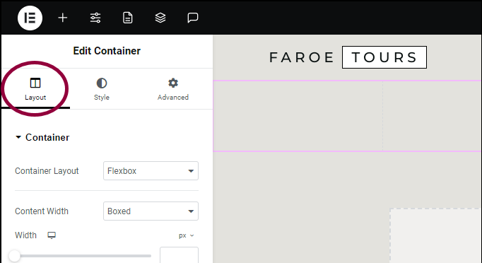
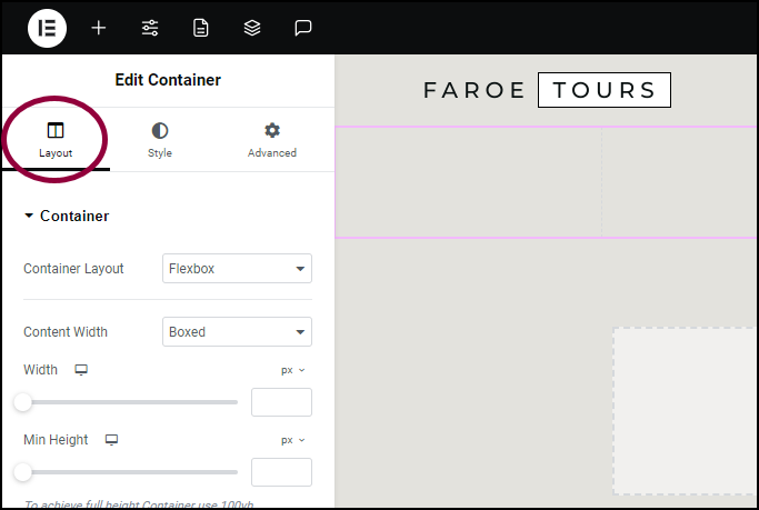
WordPress Themes
Many WordPress themes offer built-in settings for adjusting page width. These settings are often found in the theme customizer or theme options panel.
- Navigate to Appearance > Customize
- Look for the Layout or Design section
- Adjust the width settings as needed
Some themes also provide predefined layouts like boxed or full-width. Choose the layout that suits your content best.
Custom Css
For more control, you can use Custom CSS. This allows you to set the exact width you want. Follow these steps:
- Navigate to Appearance > Customize > Additional CSS
- Add the following code:
  .site {
    max-width: 1200px;
    margin: 0 auto;
  }
Replace 1200px with your desired width. This code centers your content and sets a maximum width.
For more specific adjustments, use CSS classes for different page elements. This can be useful for customizing headers, footers, and sidebars independently.
Testing And Adjusting Width
Finding the perfect width for your WordPress pages can be tricky. Testing different widths can help you find what works best. Adjusting the width is a continuous process. It ensures that your website looks great on all devices.
A/b Testing
A/B testing helps you compare two different widths. This method allows you to see which width performs better. You can use tools like Google Optimize for A/B testing.
- Create two versions of your page with different widths.
- Direct 50% of your traffic to each version.
- Analyze the results to see which width has better engagement.
A/B testing provides data-driven insights. It helps you make informed decisions about the best width.
User Feedback
User feedback is crucial for adjusting the width of your pages. Ask your users what they think about the layout. Their opinions can guide you in making adjustments.
- Conduct surveys to gather user opinions.
- Use heatmaps to see how users interact with your page.
- Analyze comments and suggestions from your users.
User feedback helps you understand what works and what doesn’t. It ensures that your website meets user expectations.
| Method | Pros | Cons |
|---|---|---|
| A/B Testing | Data-driven, Objective | Time-consuming, Requires technical skills |
| User Feedback | Direct opinions, Easy to gather | Subjective, May be biased |
Both methods are effective for adjusting the width of WordPress pages. Combining them can give you the best results.

Credit: visualmodo.com
Case Studies
Understanding the optimal width of WordPress pages is crucial. It affects user experience and visual appeal. In this section, we explore real-world examples. We will see what width works best and why.
Successful Examples
Let’s look at some successful WordPress sites. These examples show how different widths impact user engagement.
| Website | Page Width | Outcome |
|---|---|---|
| Site A | 960px | Higher engagement |
| Site B | 1200px | Better readability |
| Site C | 1024px | Balanced layout |
Lessons Learned
We can learn valuable lessons from these case studies. Here are the key points:
- Site A: A narrower width (960px) keeps content focused.
- Site B: A wider width (1200px) allows for more content.
- Site C: A medium width (1024px) offers a balanced view.
We see that different widths serve different needs. A narrower width can enhance focus. A wider width can display more information. A balanced width can offer the best of both worlds.
Frequently Asked Questions
What Is The Ideal Width For Boxed WordPress Pages?
The ideal width for boxed WordPress pages is typically between 960px and 1200px. This range ensures good readability and a pleasing aesthetic. It also maintains compatibility with most modern devices.
How Do I Set The Width Of My WordPress Page?
You can set the width of your WordPress page through the theme customizer. Navigate to Appearance > Customize > Layout. Adjust the width settings according to your preference.
Why Choose Boxed Layout For WordPress?
A boxed layout offers a clean and organized look. It helps to focus user attention on the content. It also provides better readability and a structured design.
Does Screen Size Affect WordPress Page Width?
Yes, screen size affects the appearance of your WordPress page. Responsive design adjusts the layout based on the screen size. This ensures a seamless user experience across devices.
Conclusion
Choosing the ideal width for your WordPress pages is crucial for a polished look. Aim for a width between 960px and 1200px for optimal readability. This range ensures a balanced and user-friendly experience. Adjust based on your site’s unique design needs to create the best visual impact.