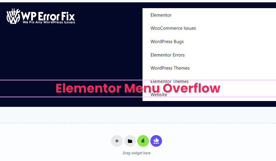
Elementor menu overflow occurs when the menu items exceed the available space on the screen. This can disrupt the website’s layout and user experience.
Elementor is a popular WordPress page builder that offers extensive customization options. Yet, managing menu items can be tricky. Menu overflow happens when too many items fit within the designated space. This issue can make your website look cluttered and unprofessional.
Optimizing the menu ensures a clean, user-friendly interface. Solutions include reducing menu items, using submenus, or adjusting the menu’s style settings. Proper management of Elementor menus enhances navigation and improves the overall user experience. Prioritize a streamlined menu to maintain a visually appealing and functional website.

Credit: www.reddit.com
Identifying Overflow Causes
Understanding the causes of Elementor Menu Overflow is crucial. It ensures your website looks great across all devices. Let’s dive into the main reasons behind this issue.
Responsive Design Challenges
Responsive design ensures your website works on all screen sizes. Sometimes, the menu items don’t fit on smaller screens. This is a common cause of overflow. You need to test your website on various devices.
One way to address this is by using breakpoints. Breakpoints help adjust the design for different screen sizes. You can set different styles for tablets, mobiles, and desktops.
Another tip is to use flexible units like percentages instead of fixed units. This makes your design more adaptable. Also, consider hiding less important menu items on smaller screens.
Content Overload
Too much content in the menu can cause overflow. It’s important to keep your menu simple. Visitors should easily find what they need.
Here are some tips to manage content overload:
- Use dropdown menus to group related items.
- Prioritize the most important links.
- Consider using a hamburger menu for mobile devices.
Reducing the number of menu items can improve user experience. It makes navigation faster and easier.
| Device Type | Recommended Menu Style |
|---|---|
| Desktop | Full menu with dropdowns |
| Tablet | Condensed menu with dropdowns |
| Mobile | Hamburger menu |
By addressing these causes, you can prevent menu overflow. This ensures a smooth user experience on all devices.
Credit: www.reddit.com
Adjusting Menu Settings
Adjusting the menu settings in Elementor is crucial for a seamless user experience. It ensures that your website menu looks great on all devices and screen sizes. This section will cover key aspects of menu adjustments, focusing on custom breakpoints and menu width settings.
Custom Breakpoints
Custom breakpoints allow you to tailor your menu for different screen sizes. This feature helps create a responsive design. Below is a brief guide on setting custom breakpoints:
- Access the Responsive Mode: Open Elementor and click on the responsive mode button.
- Set Breakpoints: Define the breakpoints for mobile, tablet, and desktop views.
- Adjust Elements: Modify the menu elements to fit each breakpoint.
Using custom breakpoints ensures your menu looks perfect on any device.
Menu Width Adjustments
Adjusting the menu width is essential for maintaining a clean layout. You can control how much space the menu occupies on the screen. Here’s a simple way to adjust menu width:
- Open the Menu Settings: Go to the menu section in Elementor.
- Select Width Option: Choose a fixed or flexible width for your menu.
- Set Desired Width: Input the width percentage or pixel value.
For a balanced design, ensure the menu width complements other page elements.
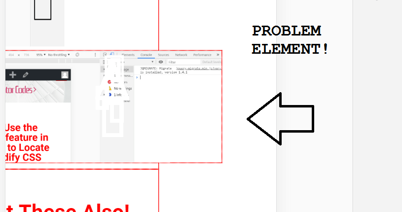
Using Css For Quick Fixes
Using CSS for quick fixes can solve Elementor menu overflow issues. These fixes help maintain a clean and responsive design.
Overflow Property
The overflow property controls content that spills outside an element’s box. Using this property ensures menus fit within their containers.
| Value | Description |
|---|---|
visible | Content overflows outside the box. |
hidden | Overflowing content is clipped. |
scroll | Scroll bars are added for overflow. |
auto | Scroll bars are added when needed. |
Use the following CSS code to control overflow:
nav {
  overflow: hidden;
}
Media Queries
Media queries adjust styles based on screen size. This is crucial for responsive menus.
Here are some common breakpoints:
- Small devices (phones):
max-width: 600px - Medium devices (tablets):
max-width: 768px - Large devices (desktops):
min-width: 992px
Use media queries to adjust menu styles:
@media (max-width: 768px) {
  nav {
    overflow: auto;
  }
}
These simple CSS changes can make your Elementor menu look great on any device.
Leveraging Elementor Features
Elementor is a powerful tool for web design. It offers amazing features to handle menu overflow. This section explores how to use Elementor for better menu design.
Flexible Containers
Flexible containers allow you to manage your menu layout. You can adjust the size of each menu item. This ensures a neat and tidy appearance.
Using flexible containers, you can also create responsive menus. This means your menu will look good on all devices. Here is a simple example:
HomeAbout
Services
Contact
Custom Menu Widgets
Elementor offers custom menu widgets. These widgets help you create unique menus. You can add icons, change colors, and more.
With custom menu widgets, you can make your menu stand out. Here are some features:
- Icons beside menu items
- Custom colors for each menu item
- Hover effects for better interaction
These features improve user experience. They make your site look professional.
Testing Across Devices
Ensuring your Elementor menu functions properly on all devices is crucial. Visitors use various devices to access your site. A broken menu can lead to a poor user experience. Testing across devices helps ensure your menu is responsive and user-friendly.
Mobile Testing
Mobile devices are widely used today. It’s important to test your Elementor menu on various mobile devices.
- Check menu visibility: Ensure the menu is visible on small screens.
- Test touch responsiveness: Ensure all menu items are easy to tap.
- Verify dropdown behavior: Ensure dropdowns work correctly on touchscreens.
Use browser developer tools to simulate different mobile devices. This will help identify any issues on smaller screens.
Tablet And Desktop Views
Tablets and desktops offer larger screen real estate. Testing on these devices ensures your Elementor menu looks good and works well.
- Check alignment: Ensure the menu aligns properly on larger screens.
- Test hover effects: Ensure hover effects work as expected on desktops.
- Verify dropdown menus: Ensure dropdowns display correctly on larger screens.
Use different browsers to test your menu on desktops. This ensures cross-browser compatibility.
Ensuring your Elementor menu works well across all devices is essential. Good testing practices lead to a better user experience.
Optimizing Menu Performance
Ensuring your Elementor menu performs well is crucial. A slow menu can frustrate users. It can also hurt your website’s SEO. This section will guide you on optimizing menu performance effectively.
Load Times
Load times are critical for user retention. A fast-loading menu keeps users happy. It also improves your website’s ranking.
- Minimize HTTP Requests: Combine CSS and JavaScript files.
- Enable Caching: Use a caching plugin to store static files.
- Optimize Images: Compress images used in the menu.
These steps reduce load times significantly. Your menu will feel snappy and responsive.
User Experience
A good user experience is essential. A well-optimized menu enhances it. Users navigate easily and find what they need.
- Clear Structure: Use a logical structure for menu items.
- Mobile Responsiveness: Ensure the menu works on mobile devices.
- Accessibility: Make the menu accessible to all users.
Focus on these points to improve the user experience. A well-structured menu makes navigation seamless.
| Optimization Task | Description |
|---|---|
| Minimize HTTP Requests | Combine CSS and JavaScript files. |
| Enable Caching | Use a caching plugin to store static files. |
| Optimize Images | Compress images used in the menu. |
| Clear Structure | Use a logical structure for menu items. |
| Mobile Responsiveness | Ensure the menu works on mobile devices. |
| Accessibility | Make the menu accessible to all users. |
Follow these steps to optimize your Elementor menu. Your users will thank you for it.
Troubleshooting Common Issues
Elementor menus sometimes face problems. This guide will help you fix them. Let’s explore common issues like broken links and inconsistent styling.
Broken Links
Broken links can confuse users. Follow these steps to fix them:
- Check the URL: Ensure the URL is correct.
- Update Permalinks: Go to Settings > Permalinks and click “Save Changes”.
- Clear Cache: Clear your browser and plugin cache.
- Test Links: Use a link checker tool to find broken links.
These steps help ensure all menu links work. Users will have a smooth experience.
Inconsistent Styling
Inconsistent styling can make your menu look bad. Here’s how to fix it:
- Review Theme Settings: Check your theme’s menu settings.
- Check CSS: Look for custom CSS that might affect the menu.
- Use Elementor Settings: Go to Elementor settings and adjust the menu style.
- Clear Cache: Clear all caches to see the changes.
These steps will help keep your menu looking great. Your site’s design will stay consistent.
Credit: element.how
Conclusion
Mastering the Elementor menu overflow enhances your website’s user experience. Implement these tips to streamline navigation. Your site will benefit from improved usability and a polished appearance. Stay ahead by keeping your menus organized. Happy designing!