To make a header stick to the top of the page, use CSS with the “position: fixed” property. Ensure the header has a “top: 0” value. However, there are many methods to achieve this, including using plugins and customizing theme settings. Read the full article to know more.
Creating a sticky header enhances user experience by keeping essential navigation in view. This method ensures easy access to menu items and important links. Users can navigate your site effortlessly, improving overall satisfaction. Implementing a sticky header involves simple CSS adjustments, making it an efficient solution so you know How to Make a Header Stick to the Top of the Page: Easy Guide.
Many websites benefit from this technique, increasing their usability and engagement. Sticky headers are particularly useful for mobile users, providing consistent navigation. They also contribute to a more professional website appearance. By keeping your header visible, you help users stay oriented and make navigation intuitive. This small change can significantly enhance your site’s functionality.
Sticky Header Basics
Creating a sticky header can greatly improve your website’s user experience. This feature keeps your header fixed at the top of the page as users scroll. This ensures important navigation links are always visible. Let’s dive into the Sticky Header Basics to understand its core concepts and benefits.
What Is A Sticky Header?
A sticky header is a website header that remains at the top of the screen. It stays visible even when users scroll down the page. This type of header is also known as a fixed header. It ensures that key navigation links and branding are always accessible. Sticky headers use CSS to achieve this effect.
Here’s an example of CSS code to create a sticky header:
.header {
  position: -webkit-sticky; / For Safari /
  position: sticky;
  top: 0;
  background-color: #333;
  color: white;
  padding: 10px;
  z-index: 1000; / Ensures the header stays on top /
}
Key characteristics of a sticky header include:
- Fixed Position: The header doesn’t move with the page content.
- Visibility: Important links remain accessible.
- Usability: Users can navigate easily without scrolling back up.
Benefits Of Sticky Headers
Sticky headers offer several advantages that enhance user experience and website performance.
- Improved Navigation: Users can easily access the main menu.
- Brand Visibility: Your logo and brand message stay in view.
- Better User Experience: Users don’t have to scroll up for navigation.
- Increased Engagement: Quick access to key links boosts interaction.
Additionally, sticky headers can improve SEO performance. They keep important content visible, reducing bounce rates. Users find it easier to navigate, leading to more time spent on your site.
Here’s a table summarizing the benefits:
| Benefit | Description |
|---|---|
| Improved Navigation | Easy access to the main menu |
| Brand Visibility | Logo and brand message stay in view |
| Better User Experience | Users don’t need to scroll up for navigation |
| Increased Engagement | Quick access to key links boosts interaction |
Css Techniques
Making a header stick to the top of the page is crucial for user experience. It ensures that navigation remains accessible as visitors scroll. CSS techniques make this task straightforward and effective. Below, we delve into two primary methods: Using Position Fixed and Setting Z-Index.
Using Position Fixed
One of the most effective ways to stick a header to the top is by using the position: fixed; property in CSS. This technique pins the header in place, even as users scroll down the page.
Here’s a simple example:
header {
  position: fixed;
  top: 0;
  width: 100%;
}
This code snippet ensures the header stays at the top. Let’s break it down:
- position: fixed; – This locks the header in place.
- top: 0; – This places the header at the very top.
- width: 100%; – This ensures the header spans the full width of the page.
Using fixed positioning can affect the layout of the rest of the page. To prevent content from hiding behind the header, add padding to the top of the main content:
body {
  padding-top: 60px; / Adjust based on header height /
}
In summary, position: fixed; is a simple yet powerful CSS technique to keep headers accessible at all times.
Setting Z-index
Another critical aspect of making a header stick to the top is the z-index property. This controls the stack order of elements. By setting a higher z-index on your header, it stays above other content.
Consider this example:
header {
  position: fixed;
  top: 0;
  width: 100%;
  z-index: 1000; / Higher value means it stays on top /
}
In this code:
- z-index: 1000; – This ensures the header stays on top of other elements.
Sometimes, you may have multiple elements with z-index values. In such cases, ensure the header’s z-index is the highest:
| Element | z-index |
|---|---|
| Header | 1000 |
| Navigation Menu | 900 |
| Main Content | 1 |
By setting appropriate z-index values, your header remains visible and accessible, enhancing the user experience.
Javascript Solutions
Making a header stick to the top of the page can improve user experience. JavaScript solutions offer a flexible way to achieve this. This method ensures the header remains visible, providing easy access to navigation and critical information as users scroll.
Detecting Scroll Events
To make a header stick to the top, start by detecting scroll events. JavaScript’s window.onscroll property or the addEventListener method can help. These tools help track the scrolling activity, allowing you to trigger actions when the user scrolls past a certain point.
Here’s a basic example:
window.onscroll = function() { myFunction() };

function myFunction() {
  if (document.body.scrollTop > 50 || document.documentElement.scrollTop > 50) {
    // Action to take when scrolled past 50px
  } else {
    // Action to take when scrolled back up
  }
}
Important points to consider:
- Cross-browser compatibility: Ensure the code works across different browsers.
- Performance: Avoid heavy operations inside the scroll event handler to keep the page responsive.
Using these methods, you can effectively monitor the user’s scroll position. This allows dynamic adjustments to the header’s position based on user interactions.
Adding And Removing Classes
After detecting scroll events, add or remove CSS classes to control the header’s behavior. This approach separates JavaScript logic from presentation, adhering to best practices.
First, define the CSS classes:
.sticky {
  position: fixed;
  top: 0;
  width: 100%;
}
Next, modify the JavaScript function to add or remove the class:
window.onscroll = function() { myFunction() };

function myFunction() {
  var header = document.getElementById("myHeader");
  if (document.body.scrollTop > 50 || document.documentElement.scrollTop > 50) {
    header.classList.add("sticky");
  } else {
    header.classList.remove("sticky");
  }
}
Benefits of this approach:
- Separation of concerns: Keeps JavaScript and CSS separate, making the code easier to maintain.
- Flexibility: Easily update the appearance by modifying CSS classes without changing JavaScript code.
Using classes also allows applying other styles and transitions. This enhances the user experience, making the header stick seamlessly as users scroll through the page.

Credit: superuser.com
Using Plugins
Creating a sticky header can significantly improve user experience by keeping important navigation always visible. Using plugins simplifies this process, especially for those unfamiliar with coding. Plugins offer quick and customizable solutions to make your header stick to the top of the page effortlessly.
Top Plugins For Sticky Headers
Several plugins can help you achieve a sticky header with ease. Here are some top choices:
- Sticky Menu & Sticky Header: This plugin is highly customizable and allows any element to stick, not just the menu.
- WP Sticky: Known for its simplicity, this plugin offers drag-and-drop functionality to make any element sticky.
- myStickymenu: Ideal for making menus sticky, this plugin also offers customization options for colors and animations.
Here’s a quick comparison table of these plugins:
| Plugin | Features | Ease of Use | Customization |
|---|---|---|---|
| Sticky Menu (or Anything!) on Scroll | Highly customizable, supports any element | Moderate | High |
| WP Sticky | Drag-and-drop functionality | Easy | Moderate |
| myStickymenu | Menu-specific, color and animation options | Easy | High |
Popular WordPress Plugins For Creating Sticky Headers
WordPress offers a plethora of plugins for creating sticky headers. Some of the most popular include:
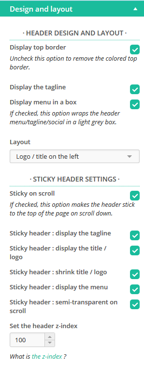
- Elementor: A comprehensive page builder with built-in sticky header options.
- Sticky Menu & Sticky Header: Focused on making headers sticky, this plugin is lightweight and efficient.
- Sticky Header Effects for Elementor: Adds extra sticky header features to the Elementor plugin, such as transparency and shrink effects.
These plugins are well-regarded for their ease of use and robust features:
Best Practices For Configuring Sticky Header Plugins
To get the most out of sticky header plugins, follow these best practices:
- Test on Multiple Devices: Ensure your sticky header looks good on desktops, tablets, and smartphones.
- Limit the Number of Sticky Elements: Too many sticky elements can clutter the screen and confuse users.
- Optimize for Speed: Ensure your plugin doesn’t slow down your site. Choose lightweight plugins whenever possible.
- Customize for Brand Consistency: Match the sticky header’s style with your site’s overall design.
Here are additional tips for effective configuration:
- Use Clear Call-to-Actions: Make sure buttons or links in the sticky header are easy to click and understand.
- Monitor User Feedback: Pay attention to user feedback to refine and improve your sticky header.
- Update Regularly: Keep your plugins updated to benefit from the latest features and security patches.
Implementing these practices will ensure your sticky header enhances user experience without compromising site performance.
Credit: m.youtube.com
Responsive Design
Creating a sticky header that remains at the top of the page while scrolling is a popular web design trend. But making it work on different screen sizes is crucial. Responsive design ensures that your sticky header looks good and functions well on both desktops and mobile devices. This section will help you understand how to adapt your sticky header for various devices.
Adapting For Mobile
Mobile users have different needs compared to desktop users. A sticky header on a small screen should not take up too much space. Here are some tips to adapt your sticky header for mobile:
- Reduce header height: Keep the header slim to save screen space.
- Use icons instead of text: Icons are easier to tap and save space.
- Make elements tappable: Ensure buttons and links are large enough to tap easily.
Here is a simple CSS example to make a header sticky and responsive:
header {
  position: -webkit-sticky; / Safari /
  position: sticky;
  top: 0;
  height: 60px; / For desktop /
  background-color: #333;
  color: white;
  text-align: center;
  line-height: 60px;
}

@media (max-width: 768px) {
  header {
    height: 40px; / For mobile /
    line-height: 40px;
  }
}
This code ensures the header sticks to the top and adjusts its height for mobile screens. Testing on various devices is vital to ensure a smooth user experience.
Media Queries For Stickiness
Media queries allow you to apply CSS rules based on the screen size. This is essential for a sticky header that works well on all devices. Here’s how you can use media queries:
/ Default styles for desktop /
header {
  position: -webkit-sticky; / Safari /
  position: sticky;
  top: 0;
  height: 60px;
  background-color: #333;
  color: white;
  text-align: center;
  line-height: 60px;
}

/ Styles for tablets and smaller screens /
@media (max-width: 1024px) {
  header {
    height: 50px;
    line-height: 50px;
  }
}

/ Styles for mobile phones /
@media (max-width: 768px) {
  header {
    height: 40px;
    line-height: 40px;
  }
}
Adjusting the header’s height for different screen sizes ensures it doesn’t take up too much space. Using media queries, you can also change the header’s font size, padding, and margins.
Here is an example of a table summarizing the header adjustments:
| Screen Size | Header Height | Line Height |
|---|---|---|
| Desktop (1024px and above) | 60px | 60px |
| Tablet (768px to 1024px) | 50px | 50px |
| Mobile (below 768px) | 40px | 40px |
Using these techniques, you ensure your sticky header works seamlessly across devices. Media queries are powerful tools for responsive design, making your website more user-friendly.
Common Pitfalls
Making a header stick to the top of the page is a common design choice. It improves navigation and keeps important links visible. But, there are some common pitfalls. If not addressed, these can affect user experience and website performance. Understanding these pitfalls can help you avoid them and create a smoother, more efficient website.
Overlapping Content
One common issue is overlapping content. This happens when the sticky header covers other elements on the page. It can hide important information and frustrate users. Here are a few tips to avoid this:
- Set a top margin: Add a margin-top to your content to ensure it starts below the header.
- Use z-index: Make sure the header’s z-index is higher than other elements but not too high.
- Check responsiveness: Ensure the header works well on all devices. Test on different screen sizes.
Here’s a simple example in CSS:
header {
  position: fixed;
  top: 0;
  width: 100%;
  z-index: 1000;
}
main {
  margin-top: 60px; / Adjust based on header height /
}
Using the above code, you ensure the header stays on top without hiding content. Always test thoroughly to avoid overlapping issues.
Performance Issues
Another pitfall is performance issues. Sticky headers can slow down your site if not optimized. Here are some tips to keep your site running smoothly:
- Minimize JavaScript: Use CSS for the sticky effect whenever possible. JavaScript can be heavier and slower.
- Optimize images: Compress images in the header to reduce load times.
- Limit animations: Avoid heavy animations in the header. They can impact performance, especially on mobile devices.
Consider this performance table:
| Aspect | Optimization Tips |
|---|---|
| JavaScript | Use CSS for sticky effect |
| Images | Compress and optimize |
| Animations | Keep it simple and minimal |
By following these tips, you can create a sticky header that enhances user experience without compromising performance. Always remember to test your site speed and make adjustments as needed.
Browser Compatibility
Making a header stick to the top of the page can enhance user experience. It ensures essential navigation links are always visible. But achieving this across different browsers is crucial. Browser compatibility ensures that your sticky header works smoothly for all users, no matter which browser they use. This section will guide you through testing and handling older versions to achieve optimal browser compatibility.
Testing Across Browsers
Testing across browsers is essential for ensuring your sticky header works everywhere. Different browsers interpret code in slightly different ways. To make sure your header behaves correctly, you must test it on all major browsers.
Here are some key browsers to test:
- Google Chrome
- Mozilla Firefox
- Safari
- Microsoft Edge
- Opera
Use tools like BrowserStack or CrossBrowserTesting to simulate different environments. These tools allow you to see how your sticky header looks and functions on various browsers. They also help identify any inconsistencies.
You can use a table to keep track of your testing process:
| Browser | Version | Status |
|---|---|---|
| Google Chrome | Latest | Pass |
| Mozilla Firefox | Latest | Pass |
| Safari | Latest | Pass |
| Microsoft Edge | Latest | Pass |
| Opera | Latest | Pass |
Handling Older Versions
Supporting older versions of browsers can be challenging. Older browsers might not support modern CSS properties like position: sticky;. In such cases, fallback solutions are necessary.
Here are some strategies for handling older browser versions:
- Use
position: fixed;as an alternative. - Include conditional comments for Internet Explorer.
- Utilize JavaScript polyfills for better compatibility.
For example, you can use this CSS for older browsers:
.header {
    position: fixed;
    top: 0;
    width: 100%;
    background-color: #fff;
    z-index: 1000;
}
Make sure to test these fallback solutions thoroughly. This ensures that users with older browsers also have a seamless experience.
Keeping a table for browser versions can help track compatibility:
| Browser | Version | Fallback |
|---|---|---|
| Internet Explorer | 11 | Fixed Position |
| Safari | 9 | JavaScript Polyfill |
By addressing older versions, you ensure a consistent experience for all users.
Advanced Customizations
Creating a sticky header that stays at the top of the page enhances user experience. Advanced customizations make your header not only functional but also visually appealing. Let’s dive into advanced techniques to make your sticky header stand out.
Animations And Transitions
To make your sticky header more engaging, consider adding animations and transitions. These effects can draw attention and make navigation smoother. Here’s how you can implement them:
- Fade-in Effect: Use CSS to make the header gradually appear as users scroll down.
- Slide-in Effect: Create a sliding animation where the header slides into view from the top.
- Color Transitions: Change the background color of the header smoothly as it sticks to the top.
Here’s a sample CSS code for a fade-in effect:
header {
  position: fixed;
  top: 0;
  width: 100%;
  opacity: 0;
  transition: opacity 0.5s ease-in-out;
}

header.sticky {
  opacity: 1;
}
To apply this effect:
- Add the ‘sticky’ class to the header when it reaches the top.
- Use JavaScript to detect the scroll position.
Animations and transitions make your header lively and interactive, improving user experience significantly.
Dynamic Headers
Dynamic headers change based on user interaction and page content. They can adapt to different scenarios, offering a personalized experience. Here are some features you can add:
- Content-Aware Headers: Adjust the header size based on the section of the page.
- Interactive Elements: Include dropdowns and search bars that appear on hover.
- Responsive Design: Ensure the header adapts well on mobile devices.
Consider this JavaScript code snippet for a dynamic header that changes size:
window.onscroll = function() {resizeHeader()};

function resizeHeader() {
  var header = document.getElementById("myHeader");
  if (document.body.scrollTop > 50 || document.documentElement.scrollTop > 50) {
    header.style.height = "50px";
  } else {
    header.style.height = "100px";
  }
}
Using dynamic headers, you can create a more engaging and user-friendly site. These headers respond to user actions, providing a smoother navigation experience.
Credit: presscustomizr.com
Conclusion
Sticking a header to the top of the page enhances user experience. It’s a simple yet effective technique. Follow our guide for quick implementation. Enjoy improved navigation and site aesthetics. Your visitors will appreciate the seamless browsing experience. Start today and see the difference it makes!