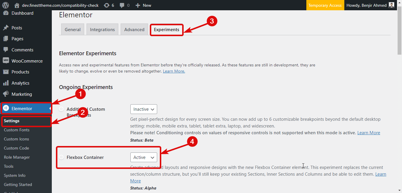
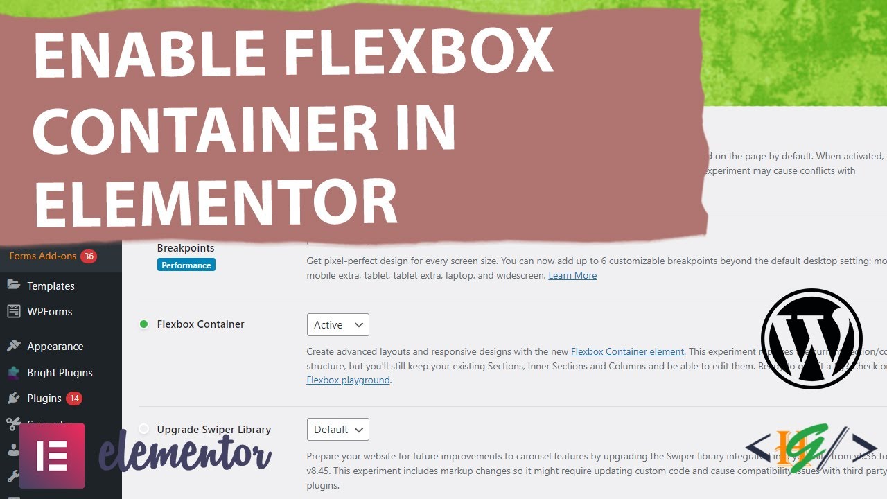
To enable Flexbox Container in Elementor, access the Elementor settings. Then, activate the Flexbox Container feature.
Flexbox Container in Elementor streamlines responsive design. It offers flexibility, aligning items efficiently across various screen sizes. This feature is crucial for modern web design, ensuring content adapts seamlessly to different devices. Activating Flexbox Container enhances the Elementor experience, making layout management more intuitive.
Users can easily align, justify, and distribute space among elements. This reduces the need for complex CSS code. It also improves website performance and design consistency. Mastering Flexbox Container can significantly elevate your web design projects. It simplifies the creation of dynamic, responsive layouts. This tool is invaluable for both beginners and advanced users, optimizing the design process.
Credit: wpmet.com
Introduction To Flexbox Container
Welcome to the world of Flexbox Container in Elementor! This powerful tool helps you design flexible and responsive layouts. Flexbox simplifies the process of creating dynamic web pages. Let’s dive into the basics of Flexbox and see how it benefits your design.
What Is Flexbox?
Flexbox stands for Flexible Box Layout. It is a CSS layout module. It provides an easier way to design complex layouts. Flexbox allows items within a container to align and distribute space efficiently. It offers more control over alignment and space distribution.
Benefits Of Using Flexbox
Using Flexbox in Elementor has several benefits:
- Responsive Design: Adjusts layouts for different screen sizes.
- Alignment Control: Easily aligns items within a container.
- Space Distribution: Distributes space among items evenly.
- Flexibility: Adjusts items based on container size.
Here is a simple example of Flexbox code:
.container {
  display: flex;
  justify-content: center;
  align-items: center;
}
The code above centers items both vertically and horizontally. Flexbox makes layout design more intuitive and efficient.
Setting Up Elementor
Elementor is a powerful tool for creating stunning websites. To get started, follow these steps to set up Elementor. This guide will walk you through the installation and navigation process.
Installing Elementor
First, you need to install Elementor. Follow these steps:
- Go to your WordPress dashboard.
- Navigate to Plugins > Add New.
- In the search bar, type Elementor.
- Click Install Now on the Elementor plugin.
- After installation, click Activate.
Elementor is now installed and ready to use.
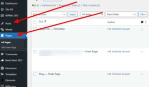
Navigating The Interface
Once installed, you need to know your way around the interface. Here’s a quick guide:
- Go to the Pages section in your dashboard.
- Select a page you want to edit or create a new one.
- Click Edit with Elementor.
The Elementor editor will open. Here are the main areas:
| Area | Description |
|---|---|
| Sidebar | Contains widgets and settings. |
| Canvas | Your live preview area. |
| Navigator | Helps you navigate your layout. |
These areas help you build and customize your pages. Explore each section to get comfortable with the interface.
Enabling Flexbox In Elementor
Flexbox is a powerful tool for web design. It helps to create flexible layouts. Using Flexbox in Elementor makes it easier to align items. This section will guide you through enabling Flexbox in Elementor.
Accessing Flexbox Settings
First, open your Elementor editor. Look for the section you want to edit. Click on the section to access the settings panel.
In the settings panel, go to the Advanced tab. Here, you will see the option for Custom CSS. Click on it to open the CSS editor.
Activating Flexbox Container
In the CSS editor, you can activate the Flexbox container. Add the following CSS code:
selector {
    display: flex;
    justify-content: center;
    align-items: center;
}
This code will enable the Flexbox container. Now, your items will align perfectly.
Below is a simple table explaining the key Flexbox properties:
| Property | Description |
|---|---|
| display | Activates Flexbox on the container |
| justify-content | Aligns items horizontally |
| align-items | Aligns items vertically |
Using Flexbox makes your design more flexible. It ensures your layout looks great on all devices.
- Open Elementor editor
- Access Advanced settings
- Enter Custom CSS
- Use Flexbox properties
Following these steps will activate Flexbox in Elementor. Your design will be more responsive and attractive.
Creating A Flexbox Layout
Flexbox is a powerful CSS layout module. It allows designing flexible and responsive layouts easily. With Elementor, you can use Flexbox containers to organize your content. Let’s dive into how to create a Flexbox layout using Elementor.
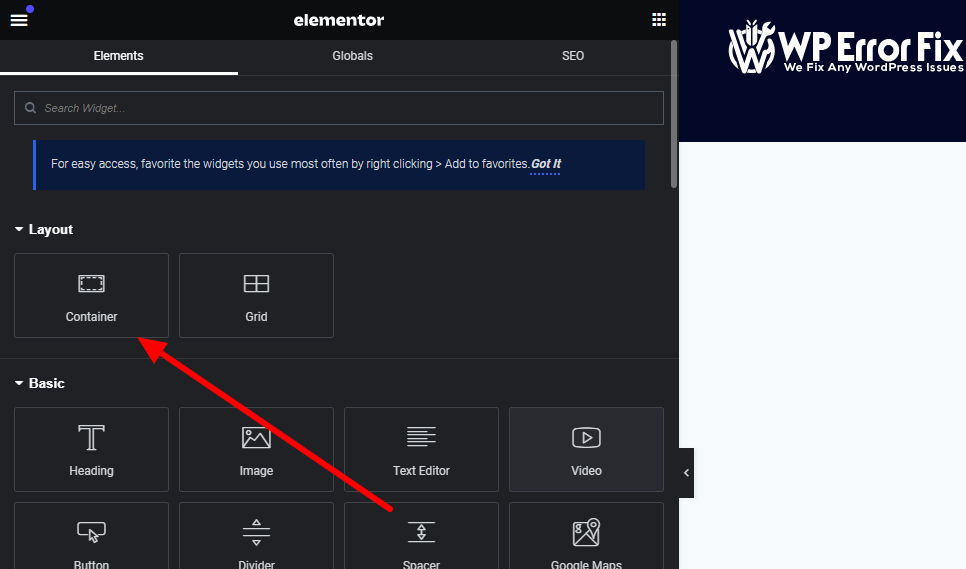
Adding Flexbox Containers
To start creating a Flexbox layout, you need to add Flexbox containers. Follow these steps:
- Open your Elementor editor.
- Click on the “+” button to add a new section.
- Select the “Flexbox Container” option.
Now, you have a Flexbox container in your layout. You can add widgets inside this container.
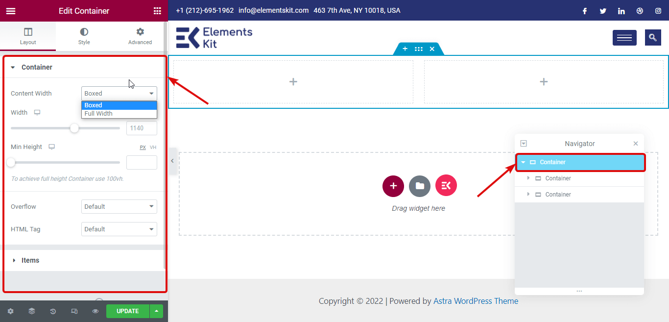
Configuring Flex Properties
Configuring Flex properties is essential to achieve the desired layout. Here’s how you can do it:
| Property | Description |
|---|---|
| Flex Direction | Defines the direction of the flexible items. |
| Justify Content | Aligns items along the main axis. |
| Align Items | Aligns items along the cross axis. |
| Flex Wrap | Allows items to wrap onto multiple lines. |
Configure these properties to customize your layout. For example, setting Justify Content to “center” aligns all items in the center.
Using Flexbox containers in Elementor makes your design process efficient. It ensures a responsive and clean layout.
Advanced Flexbox Techniques
Unlock the full potential of your web designs with Advanced Flexbox Techniques in Elementor. These techniques will elevate your layouts and enhance user experience. Learn how to nest flex containers and align content effortlessly.
Nested Flex Containers
Nesting flex containers is a powerful way to build complex layouts. By placing one flex container inside another, you can create multi-level structures with ease.
Here’s an example of nested flex containers:
Item 1Item 2
Item 3
This structure allows you to keep your layout organized and visually appealing. Use nested flex containers to create intricate designs without sacrificing readability.
Aligning And Justifying Content
Aligning and justifying content within flex containers is crucial for balanced designs. Flexbox provides several properties to control alignment and spacing.
| Property | Description |
|---|---|
align-items | Aligns items along the cross axis. |
justify-content | Distributes space along the main axis. |
align-self | Aligns a single item. |
Use these properties to achieve desired alignments:
- Center items:
justify-content: center;andalign-items: center; - Space between items:
justify-content: space-between; - Align items to the start:
align-items: flex-start;
Experiment with these properties to create visually pleasing layouts. Your content will look professional and well-organized.
Responsive Design With Flexbox
In today’s digital age, responsive design is crucial. Flexbox in Elementor enables creating adaptable and flexible layouts. This ensures websites look great on any device, from desktops to smartphones.
Media Queries And Flexbox
Media queries are essential for responsive design. They allow different styles for different screen sizes. Flexbox complements media queries by providing flexible containers.
Here is an example of using media queries with Flexbox:
@media (max-width: 600px) {
  .flex-container {
    flex-direction: column;
  }
}
In the code above, the flex container’s direction changes to column on smaller screens. This helps maintain a clean and organized layout.
Optimizing For Different Devices
Optimizing for different devices ensures your site is user-friendly. Here are some tips:
- Use Flexbox properties like justify-content and align-items.
- Test your site on various devices and screen sizes.
- Combine Flexbox with media queries for maximum flexibility.
Consider the table below for common Flexbox properties:
| Property | Description |
|---|---|
| display | Defines a flex container. |
| flex-direction | Specifies direction of flex items. |
| justify-content | Aligns items along the main axis. |
| align-items | Aligns items along the cross axis. |
Using these properties helps create a responsive and user-friendly design. Flexbox in Elementor makes it easier to build adaptable layouts. This ensures a positive user experience on any device.
Troubleshooting Common Issues
Using Flexbox in Elementor can enhance your website’s layout. Yet, issues may arise. This section helps you solve common problems.
Fixing Layout Problems
Layout problems can disrupt your design. Start by checking the Flexbox Container settings. Ensure all settings match your design goals.
Next, inspect the alignment and spacing. Misaligned elements can break layouts. Use Elementor’s tools to adjust margins and padding.
- Check the Flex Direction.
- Adjust Justify Content settings.
- Verify Align Items properties.
If the problem persists, reset the container settings. Sometimes, starting fresh can solve hidden issues.
Debugging Flexbox In Elementor
Debugging helps you find and fix errors. Use Elementor’s Inspector Tool. This tool shows the Flexbox properties applied.
To access the Inspector Tool:
- Right-click on the element.
- Select “Inspect”.
- Navigate to the “Styles” tab.
Check for conflicting CSS rules. Conflicts can cause unexpected behavior. Remove or adjust conflicting rules.
Use the browser’s DevTools for deeper inspection. Look for errors in the console. Fix any issues the console reports.
Finally, ensure all Elementor and WordPress plugins are up-to-date. Outdated plugins can cause Flexbox issues.
Credit: wpmet.com
Tips And Best Practices
Enable Flexbox Container in Elementor can significantly enhance your web design process. Here are some tips and best practices to ensure you get the most out of this powerful tool.
Maintaining Consistency
Consistency is key in web design. Ensure your Flexbox containers are uniform. Use consistent spacing, alignment, and layout. This creates a cohesive look and feel.
- Uniform Spacing: Maintain equal spacing between elements.
- Alignment: Align items uniformly within containers.
- Layout: Stick to a consistent layout structure.
Enhancing User Experience
Flexbox containers can significantly improve user experience. Make sure your design is user-friendly and intuitive. A well-designed layout increases user engagement.
- Responsive Design: Ensure your design works on all devices.
- Easy Navigation: Users should find it easy to navigate your site.
- Readability: Use clear fonts and enough white space.
| Tip | Benefit |
|---|---|
| Uniform Spacing | Creates a balanced design |
| Alignment | Improves visual appeal |
| Responsive Design | Optimizes for all devices |
| Easy Navigation | Increases user engagement |
| Readability | Enhances user experience |
Implementing these tips can make your website more effective and engaging. Ensure you use Flexbox containers to their full potential.
Credit: m.youtube.com
Conclusion
Mastering Flexbox Container in Elementor enhances your web design flexibility. It streamlines layout adjustments, making your site more responsive. Implement these tips to elevate your design skills. Your website will look modern and professional. Keep experimenting with Flexbox for even better results.
Happy designing! Need help? contact us